New Hexagons for Sanctuary Liturgical Arts
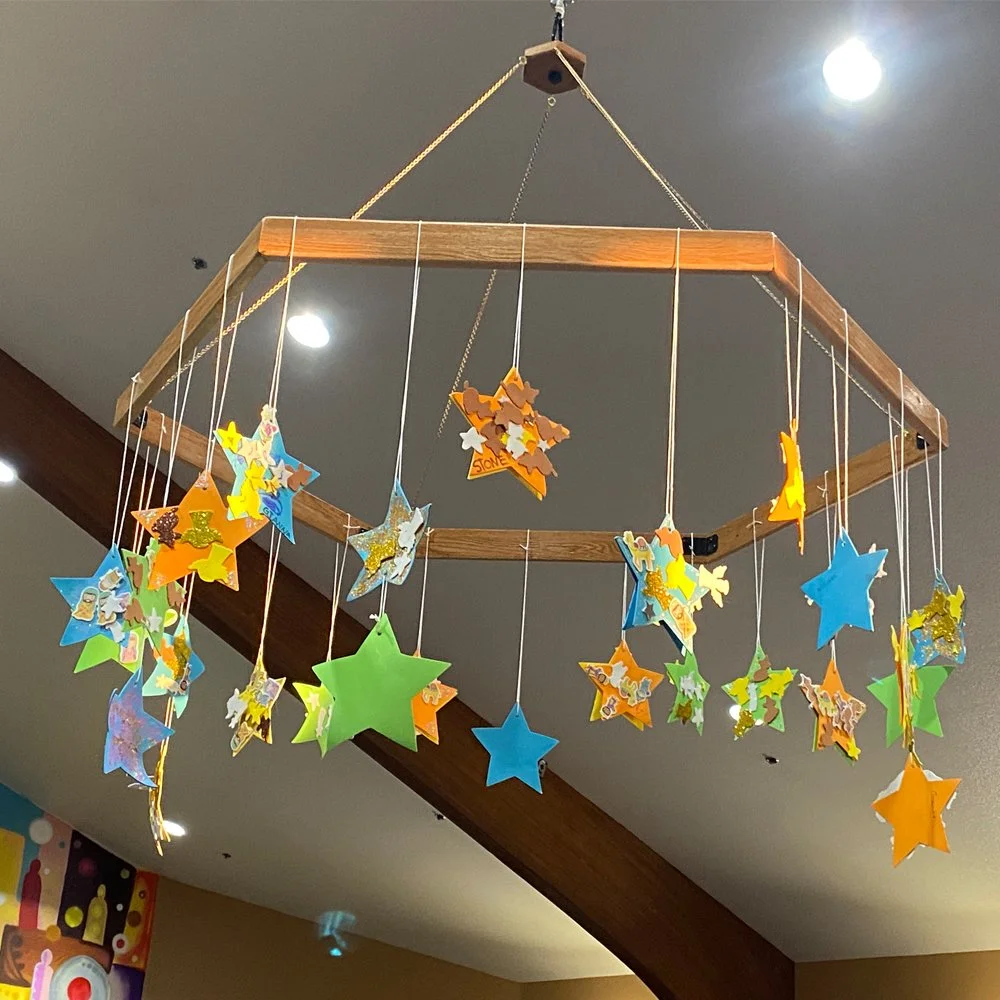
With the remodel of the sanctuary, one of our plans was to have a cable-pulley system that can be used to hang liturgical art projects from. I copied the idea from one at Our Saviour's, where I would be in charge of lowering and raising the advent wreath each week. So I asked my dad to make two big hexagons that attach to a carabiner. He came up with the idea of using old pew wood, and made two of these. Right now one is hanging with Epiphany stars that the preschoolers made. They can be for Pentecost doves, Christmas garland, anything we want to make and hang and not have to get up on a lift.
So big thanks to Rev. Paul Hammar for constructing the hexagons. Big Thanks to Laura Tanem-Hernandez and the kids for making the stars, and the help from the Preschool Advisory Board in hanging them up.
Pastor Lars
New Sanctuary Mural
The capital campaign for the church is almost over. Over $290,000 was raised, and this bought the church a whole list of much-needed repairs and upgrades. This includes:
exterior paint
mural on the outside wall of the fellowship hall by the playground
replace roof underlayment
new air conditioners for the narthex/nursery and sanctuary
livestreaming equipment
floor tiles for classrooms, fellowship hall
repaint the fellowship hall
new keyboard for the band
and the sanctuary…..
This last piece came in last, and included a whole list of things:
new carpet
repainting walls
new lights - sconses, stage lights, lights for the stone wall
build-out of the altar area into a stage-like platform
pews shortened and made moveable
mural on the back wall
replace the audio system (coming this spring)
I feel the need to list it all because it’s so impressive what we’ve been able to do with the generosity of the congregation. While the church is, and always will be, the people, and the building is just a tool we use, it’s important to keep the building in good shape and not kick the can down the road on repairs. Things never get cheaper. It’s also important to think about how your building communicates your mission, your values.
With a big mural outside, and now one in the sanctuary, we convey art, creativity, life, color. We tell people that faith is dynamic and exciting, and invite people in to explore and experience.
So this last piece, the sanctuary mural, came out of the planning process for the whole room. As you may remember, last year a team was gathered to come up with proposals for refreshing and upgrading the worship space. We looked at values, mood, function. We asked questions about what kind of things we would need in the future, so we could leave the next generation in the best place. We came up with ideas like: family, community, creativity, Jesus, welcome. We wanted it to be warm and flexible, to do creative worship and have options for different uses - hence the pews that can be moved. Everything was decided to accomplish our goals and convey our values, not to fit any particular personal preferences of the team members.
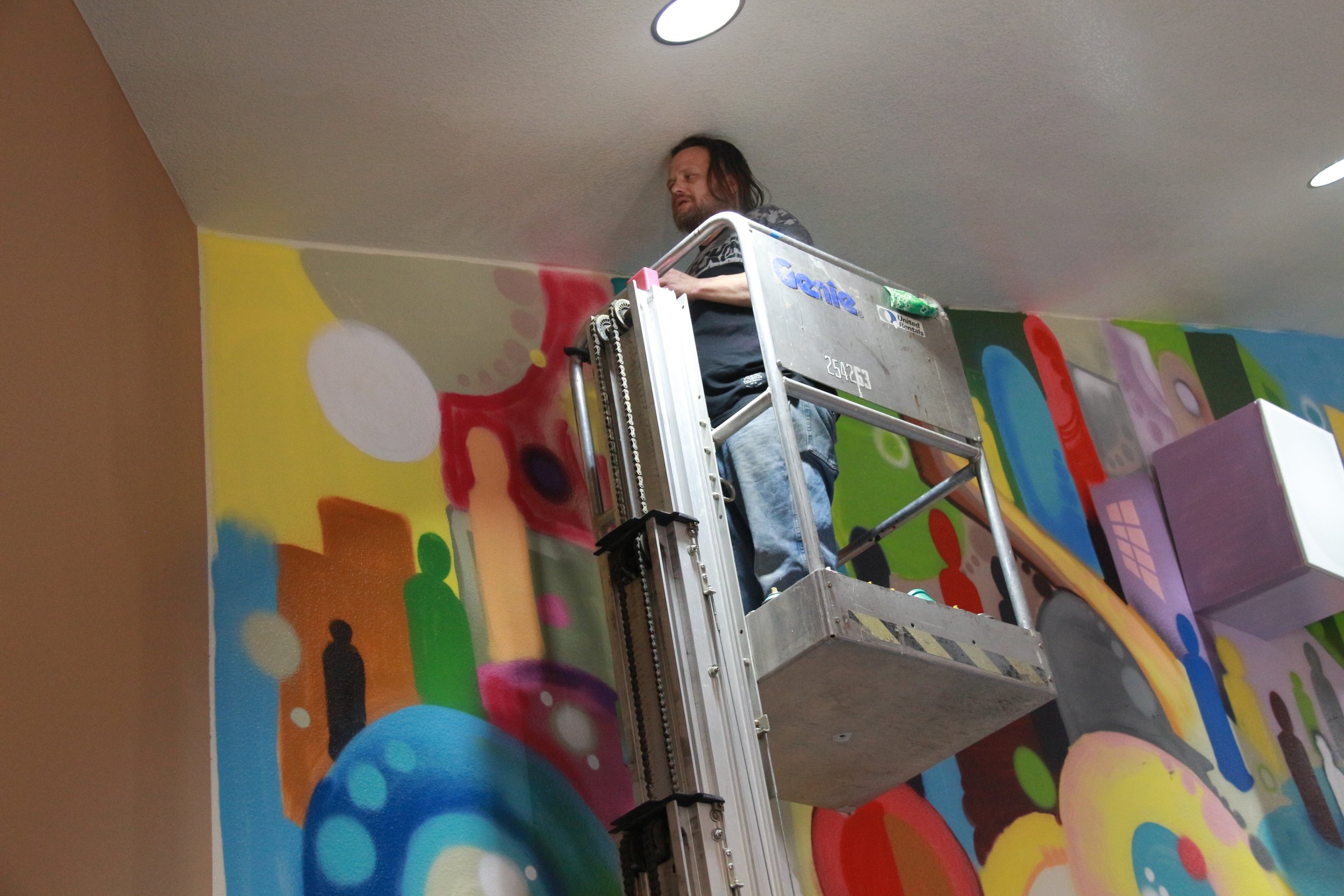
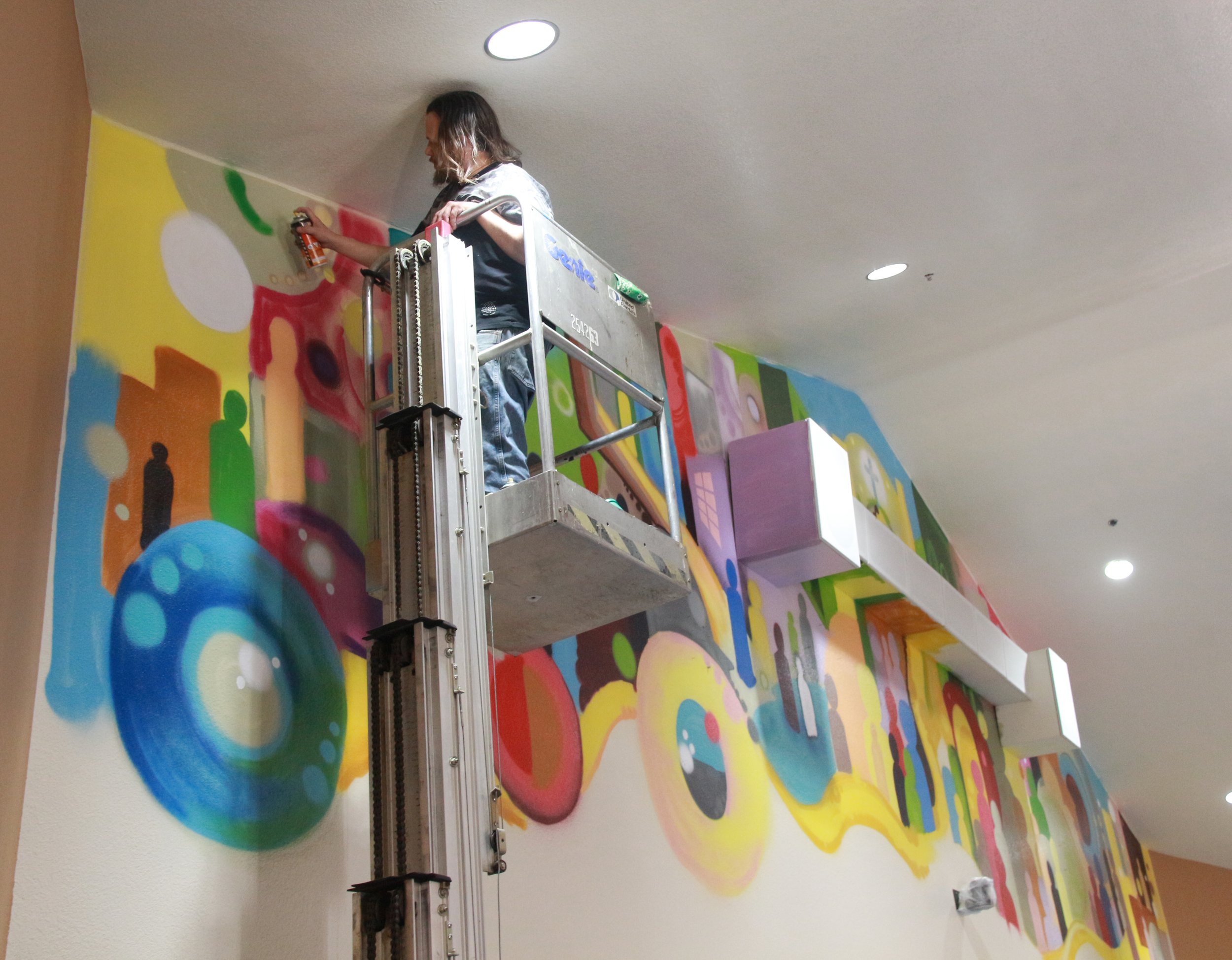
In this process the idea came up putting some sort of art on the big back wall. It just sat there empty, with nothing but livestreaming cameras and a big row of organ speakers. Initially, the plan was for a strip of Bible stories along the bottom of that wall, just above the bulkhead and the doors - much like cathedrals have a strip of carvings on the railing of the balcony. But then someone asked simply, “why not the whole wall?” Made sense.
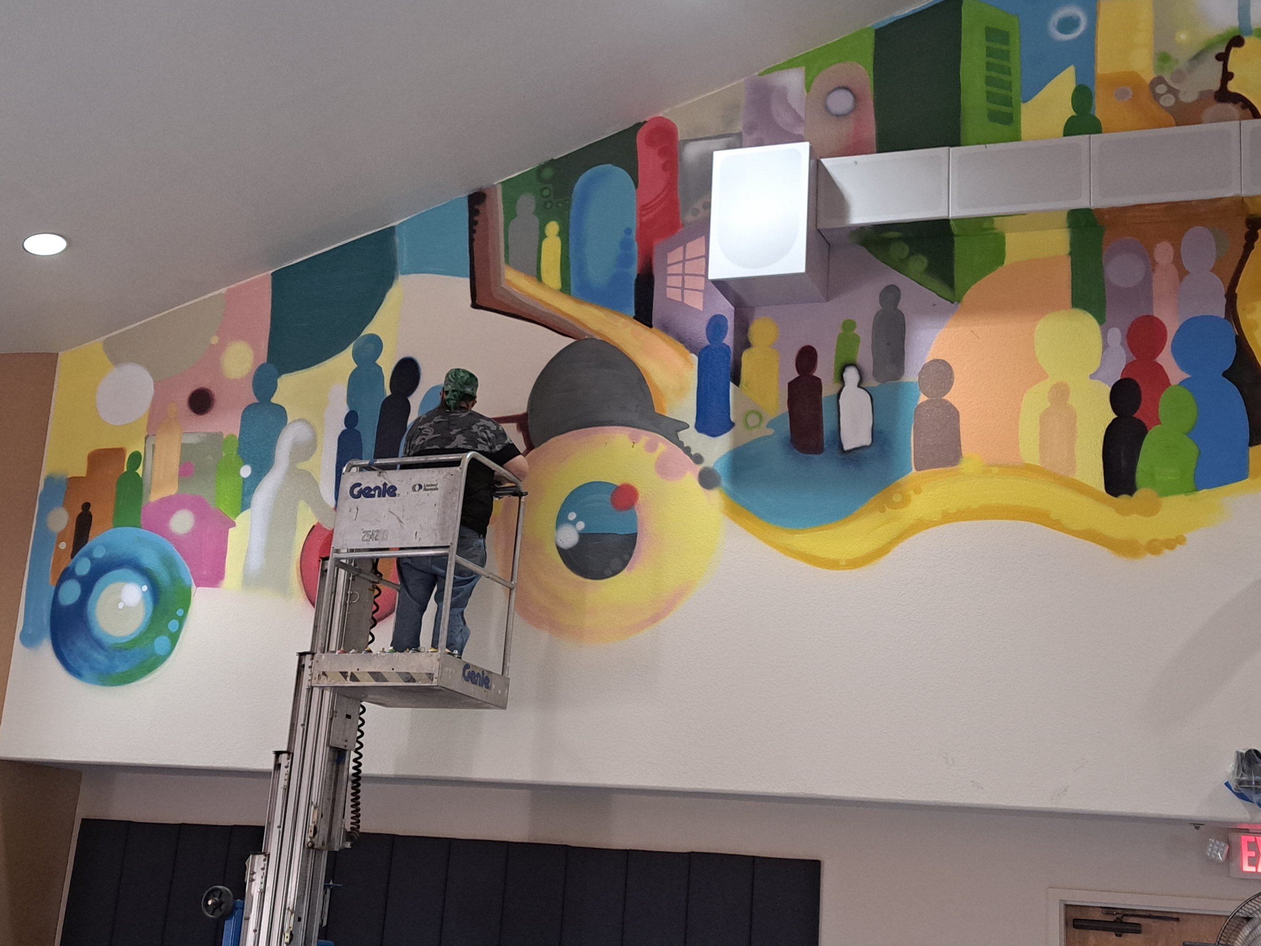
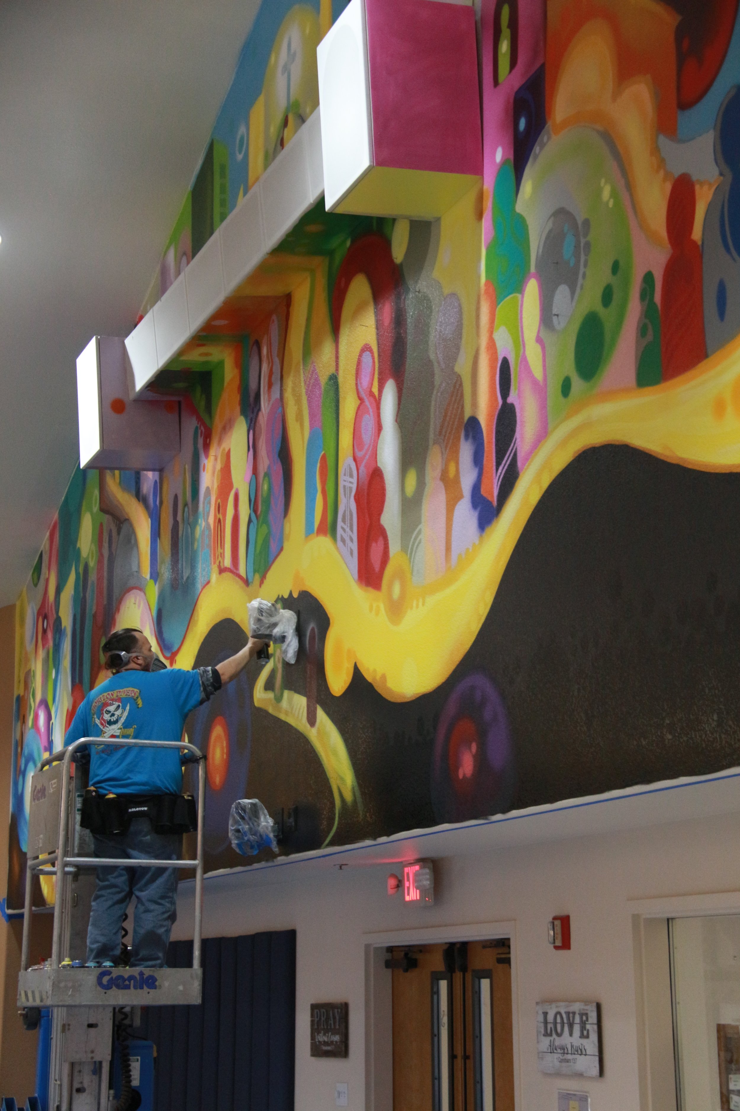
We contacted local Tucson artist Michael Schultz to do the mural. He’s a veteran graffiti artist, and was a leader in Open Space Church before it closed after Covid. Having done church murals in Las Vegas and South Tucson, he was well-skilled for a job this size.
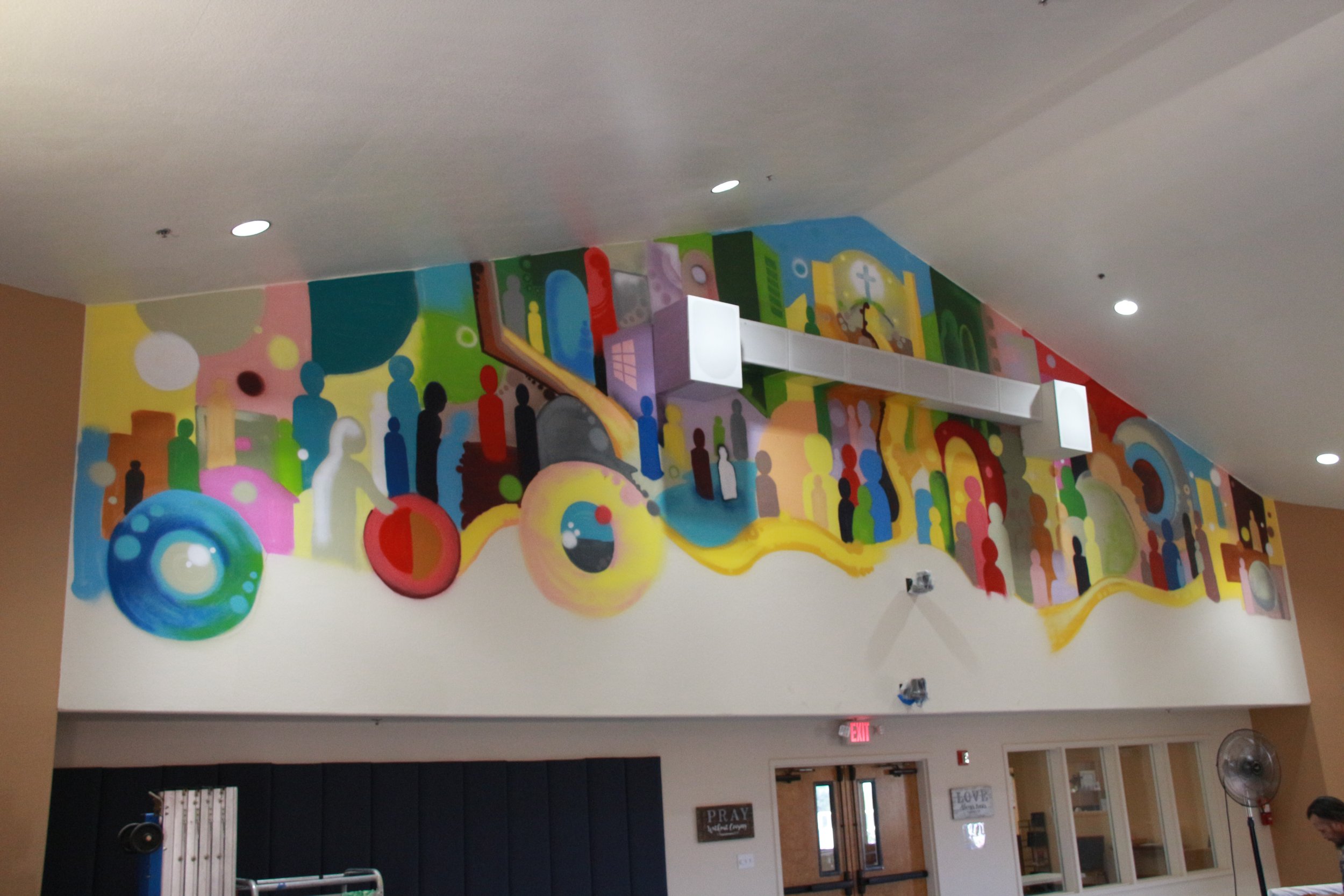
The vision was to do something modern, non-literal, and also tell some of the story of the Bible. This has three parts:
On the left: Jesus healing the woman who touches his cloak.
Middle: all the people coming together at the resurrection
Right: the women appearing at the empty tomb
Artist Michael Schultz with the finished mural
My own preference is always to keep church art a little abstract, a little modern, so we don’t start to take the image too literally and start thinking this is “how it actually looked”. We don’t know what it “really looked like” and can only make a best historical guess. But the truth of the scriptures is about more than the events, it’s about the experience people had of Jesus, and still do. It’s about how the Spirit shows you meanings in it, and the power that comes from that. So I wanted something that would both tell a story, and at the same time draw you in and get you thinking and imagining.
The splash of color is intentional, both to give it life and to contrast with the brown-blue theme of the building. It’s a highlight on your way out of worship.
In case you’re wondering, it was done with Kobra low pressure and Molotow spray paint, along with some Molotow art markers.
Pastor Lars
How Does a Weary World Rejoice - Advent 2023
A couple years ago I decided that I was going to make Advent into something special, a bit of a big deal. My phrase was to “make Advent a thing”. The initial inspiration came in fall 2021, in the middle of Covid, as we were preparing ourselves for something, but really tired out from everything. It was hard to be giddy and all wassailing with so much stress. We needed a space to step back, reflect, heal. Then, as we were getting more of our services online, the idea came to bring back mid-week Advent services as a time for that healing and processing. If people couldn’t physically come, we could put it online. Maybe someone far away would find God’s presence in the time.
Since then I’ve tried to lean into Advent, making it its own big deal, but finding ways to do that that are relevant. Years ago I gave up preaching the appointed texts in the lectionary (the set of Bible readings that come with each day of the church year). They usually include John the Baptist calling the priests a “brood of vipers”, Jesus prophecying the end of the world; John the Baptist getting his head cut off; and maybe a little Virgin Mary the last week. It was so tone deaf, in a hectic season saturated with emotions, memories, events, we were preaching about “bearing fruits worthy of repentance” so we wouldn’t get burned in the fire. I couldn’t do it anymore.
Advent is not just a time of getting ready for Christmas, not in the church year. Originally it stated mid-November, and could run as much as seven weeks. It coincided nicely with themes of darkness and long night for our northern European friends. They wrote some of the best hymns in the book for it. And, for them, it probably had little to do with John the Baptist either. It was spending lots of time huddled together telling stories, reading the Bible, and eating the dried food you processed in the fall.
This year I’m going with a theme that I got from a Christian art collective called sanctifiedart.org. I’ve used their stuff before, because it’s creative, comes with pictures and poems and lots of really good reflections on life and faith for the season. This year the theme is “How Does a Weary World Rejoice?” It’s not about weariness, as much as honestly finding the space in ourselves to rejoice in the face of it. Too much modern Christianity, in my opinion, glides over topics of grief, loss, struggle, doubt in favor of a manufactured rejoicing that can feel disjointed to the pains of modern life. Yes, I want to celebrate the season, but….my husband/wife/child died around this time and all I have are memories of loss that keep coming up. Yes, I want to smile and laugh and share a warm cider, but…..I’m drowning in anxiety about the state of the world. Of course I want to win the holiday school bake-off, but…..I am worried about my kids’ future. We’re not trying to wallow in grief, but grief finds us, and won’t let us push it aside. We want to sit in God’s presence, feel the warmth of the glow of grace, in the place where we are now.
That’s why I was so excited about this theme. We’re going to rejoice, but do so authentically. We’ll take a look at four different stories in the Gospel of Luke that lead up to Jesus’ birth, and reflect a bit on the people, their stories, their struggles, their joys, and their encounters with God. We’ll walk through with them, and let them guide us to light in the darkness, and hope in the midst of pain.
Each Sunday will be a different story. I’ll give handouts to everyone with the images, poetry, and reflections for the day when you come to the service. December 6th will be a healing service, a space for you to dwell and reflect on the wounds/pains/traumas/stresses you have and bring them to God in prayer. Our prayer team will be there to pray with you. It will be livestreamed, and we will monitor and respond to online prayer requests as well.
On December 17th will be the Longest Night service, specifically tailored to finding space to process grief, loss, and related concerns right before the big Christmas celebrations. The service will follow an order based around the theme of “rejoicing in a weary world”, and will include dedicated chunks of time to sit back, pray, reflect, and bring your grief to the God who loves you and is with you in all things. Also livestreamed.
December 24th falls on a Sunday this year, and we will do a combined service at 10am in the morning, using the traditional/liturgical format – with the children’s sermon, kids chat, and the Advent themes.
Christmas Eve services will be 6pm contemporary and 8pm traditional services.
As usual, no services on December 25th.
The next service is the combined service of lessons and carols on December 31st at 10am.
Vase-Making for Lent
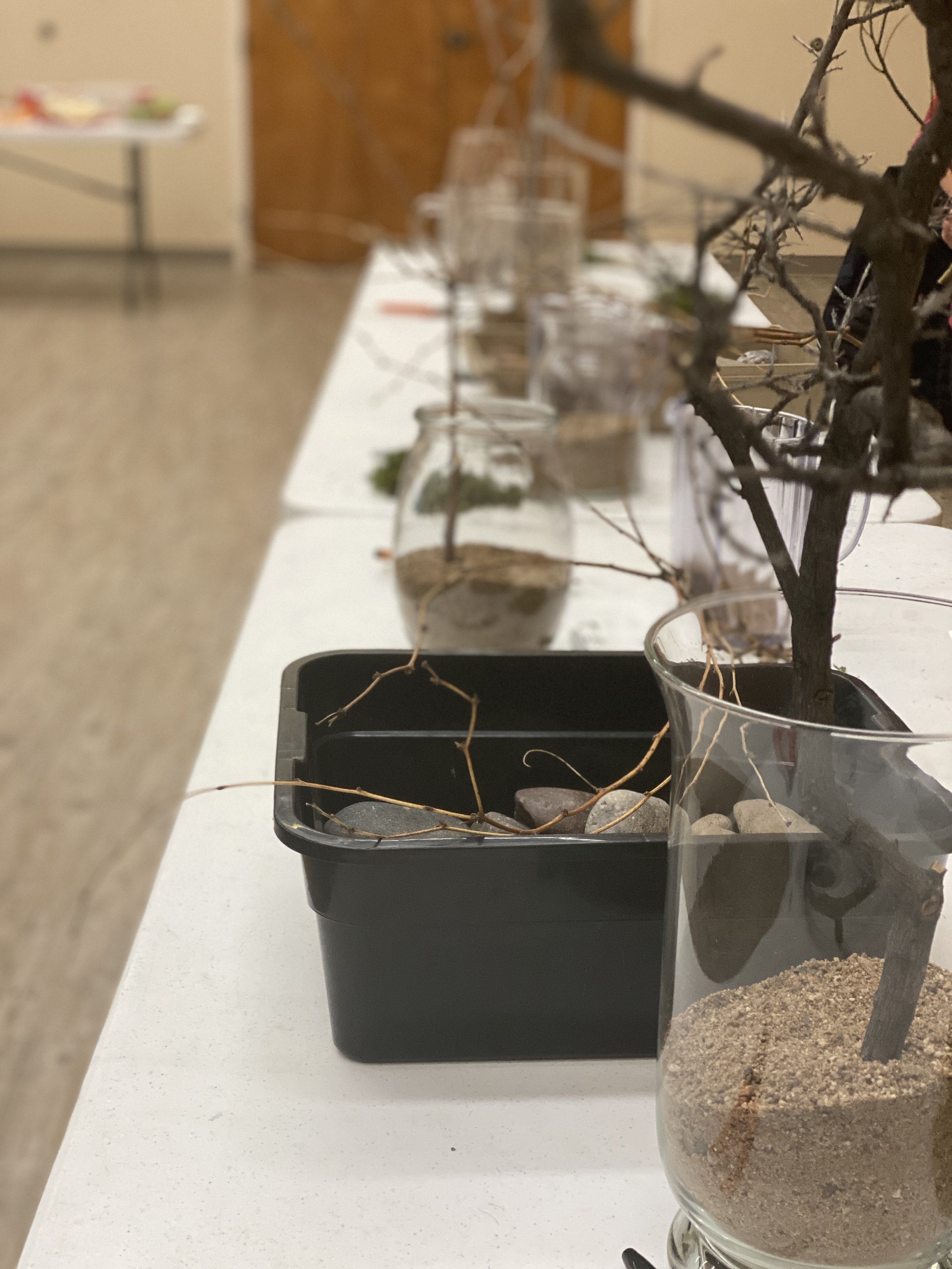
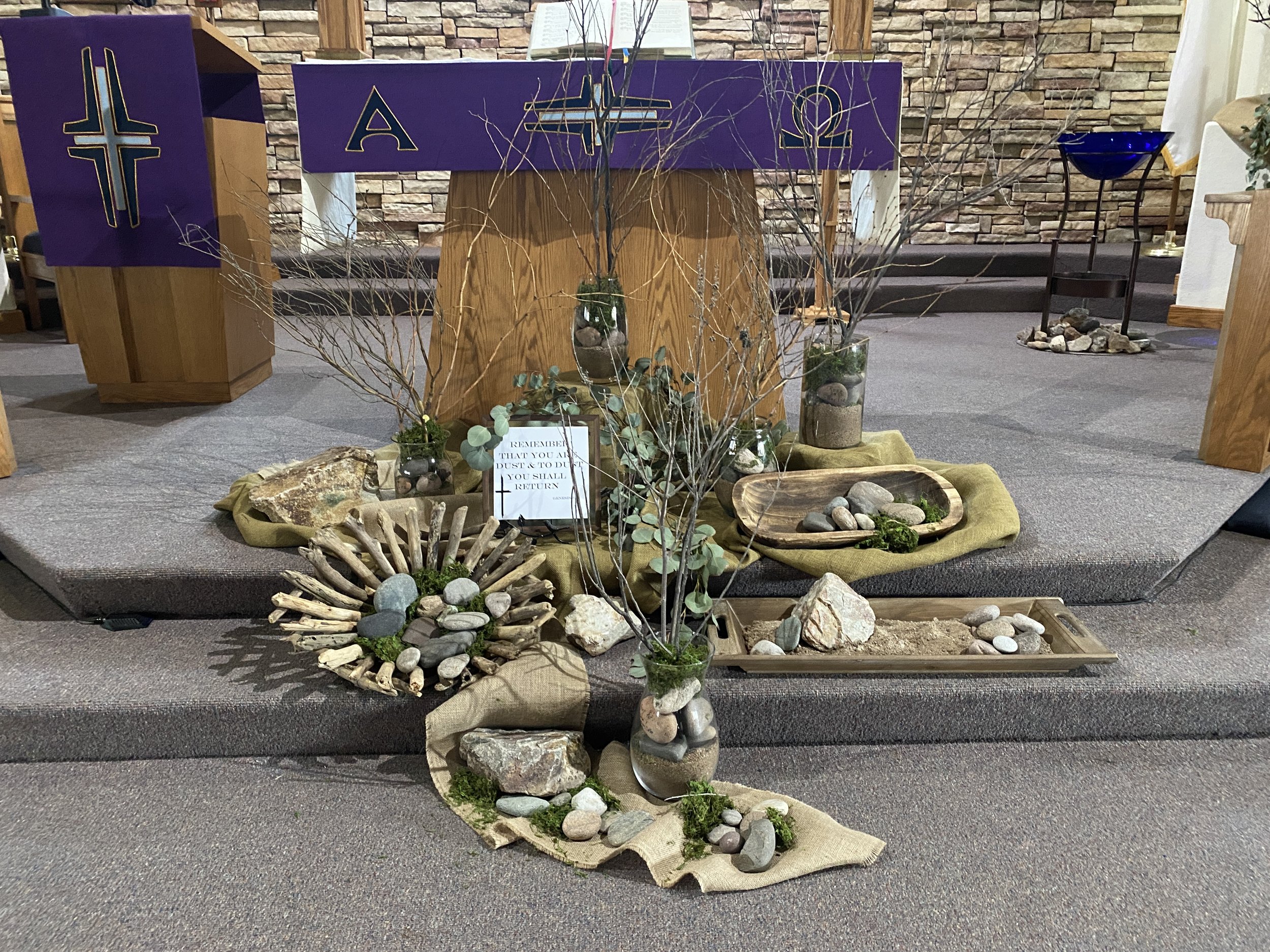
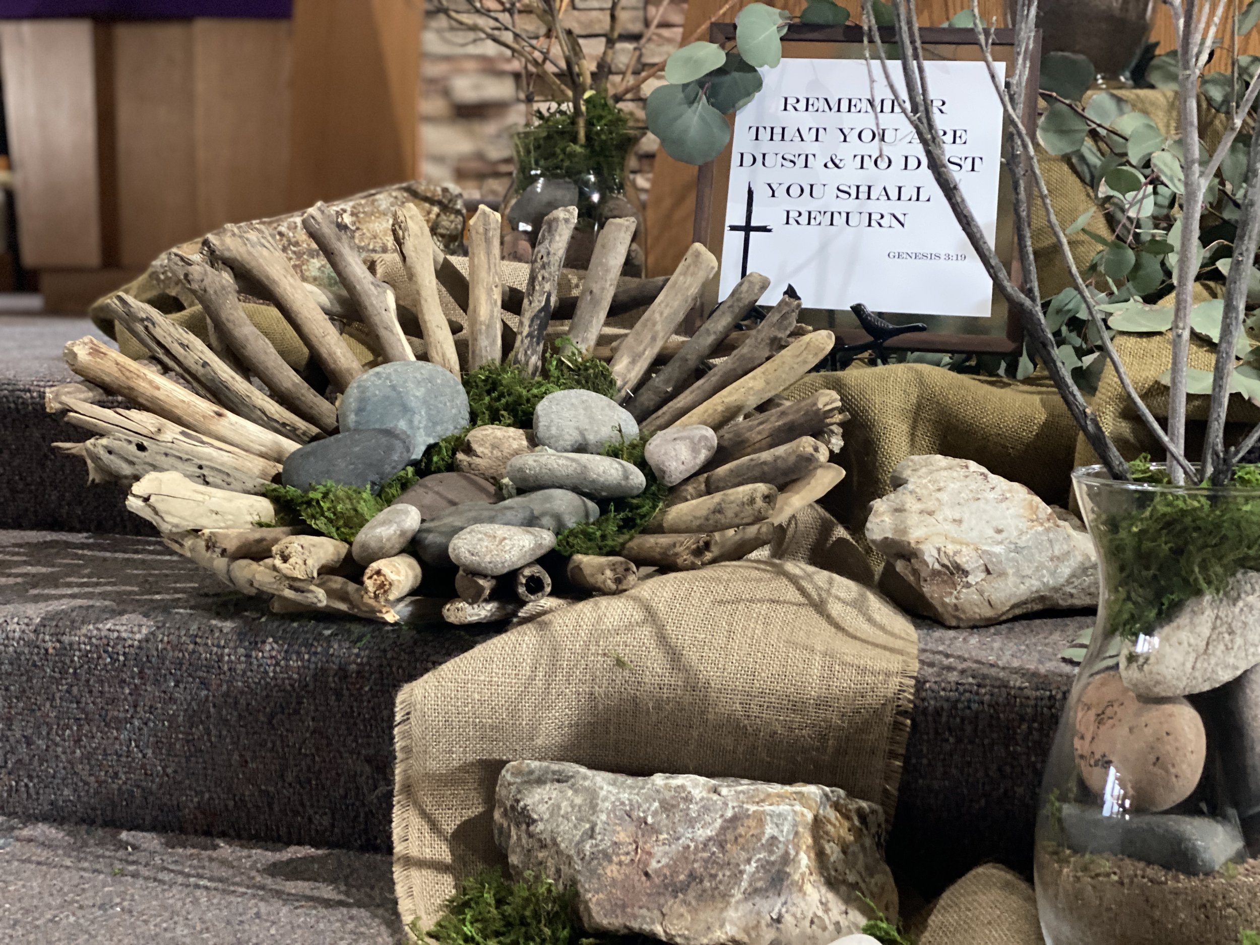
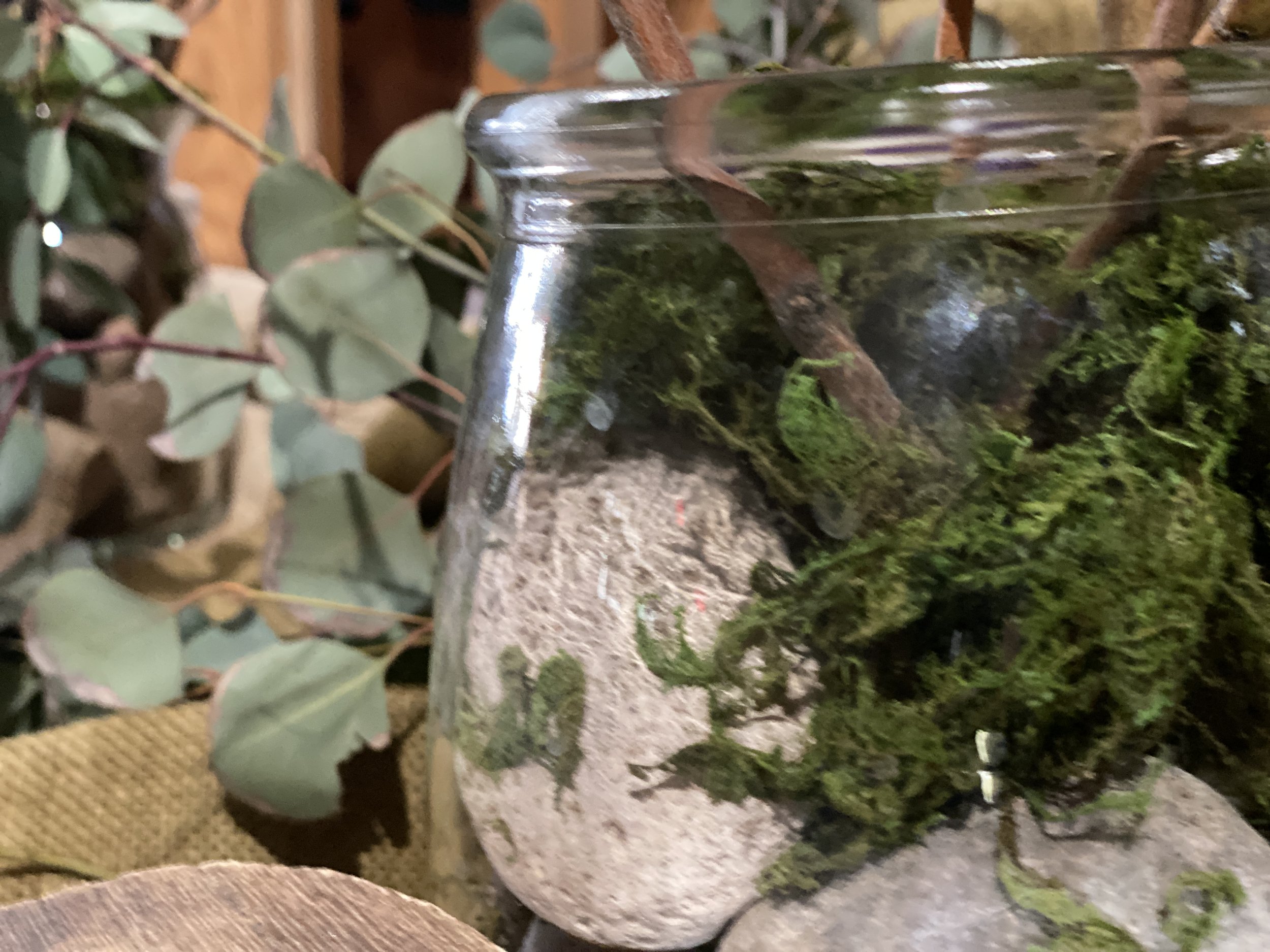
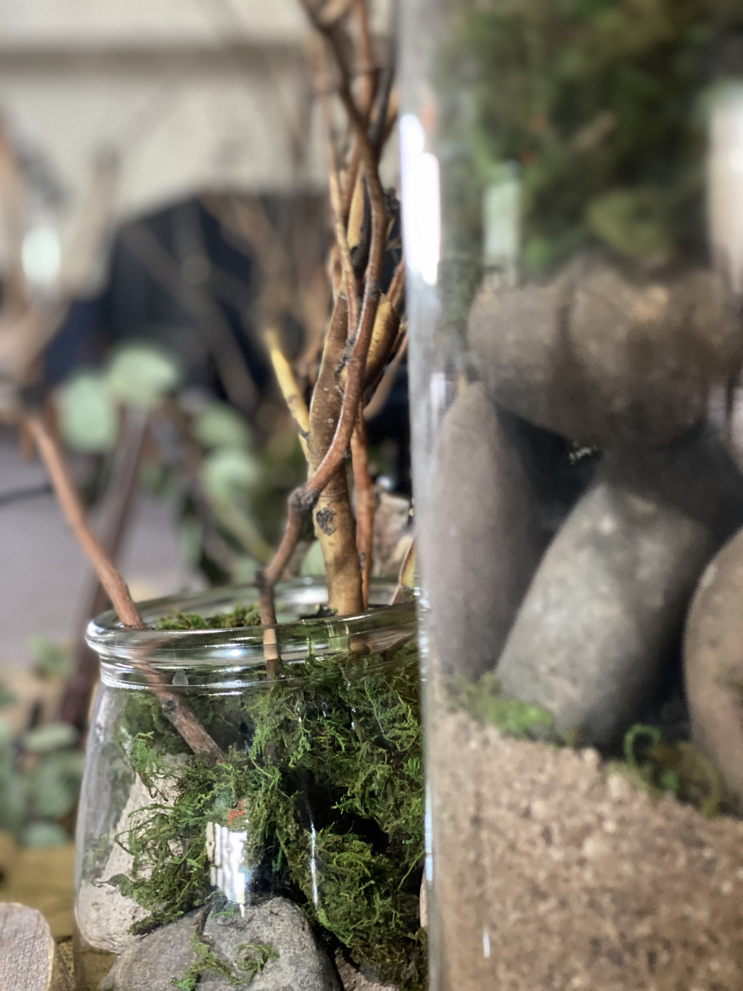
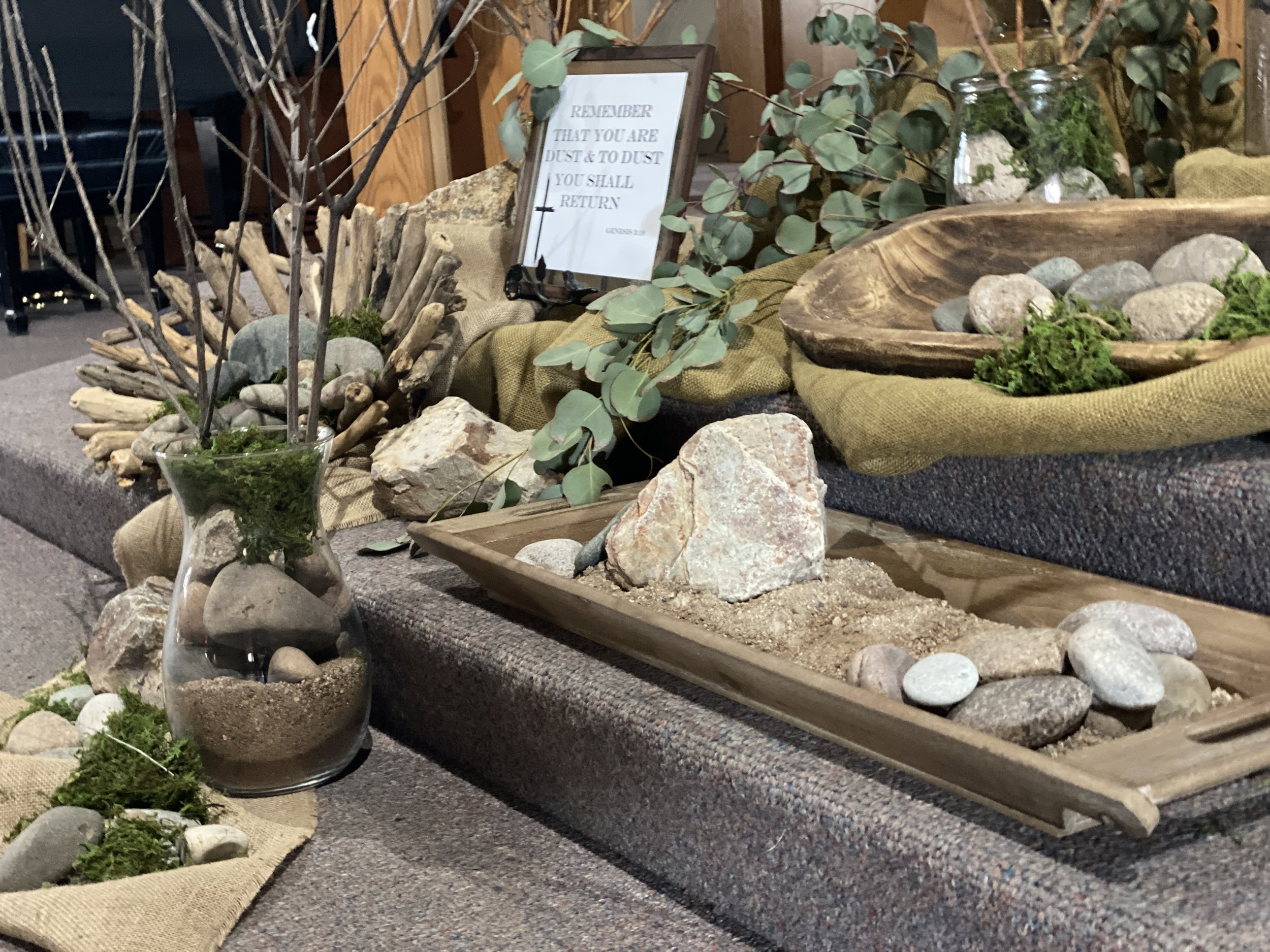
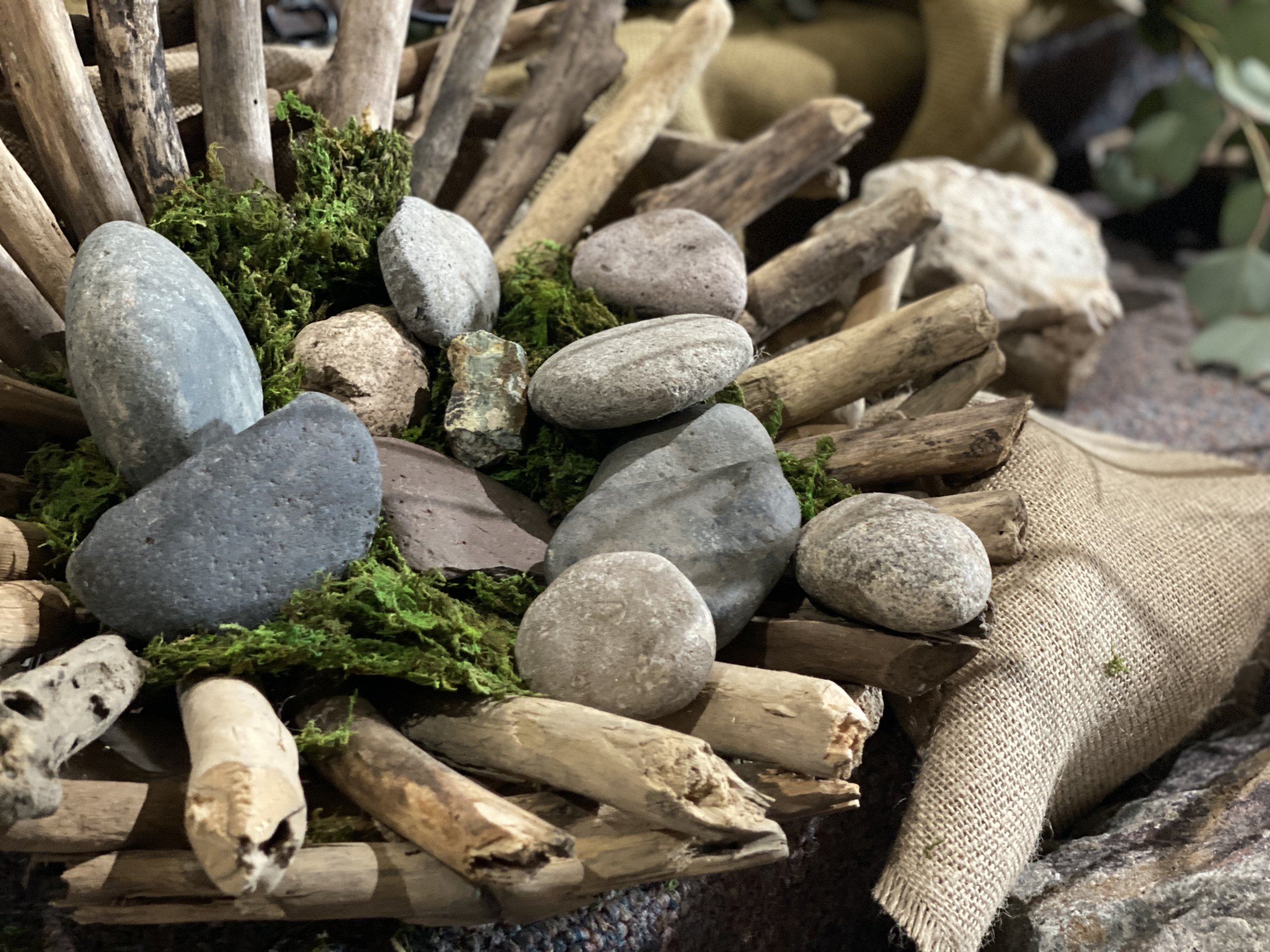
This lent we’re following a theme of “wilderness” throughout our mid-week services, and our sermons. In preparation, we put together all these vases (based on an idea from sanctifiedart.org) to place in front of the sanctuary for the Lenten season.
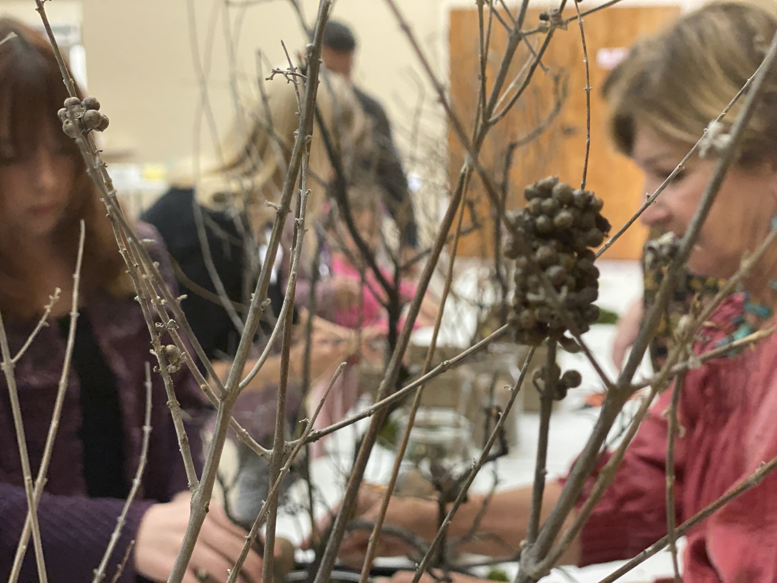
To build them we had a lunch after the second service, and then had a little liturgy where we would read a poem, based on the idea for each part of the vases, complete that part, and read again and so on.
All ages were there, kids through seniors, and we made some really cool additions to our sanctuary. A big thanks to the liturgical arts team for all the work of hunting down all the supplies, especially finding all those big vases at thrift stores.
The Church Emerging - Pastor's column Jan 2023
As I was starting in ministry at the end of the 1990’s a movement was starting called “emerging church” (I won’t capitalize it, because, to be cool, they never capitalized anything either). It was full of Gen-X pastors with grunge music in our CD players and postmodernism in our philosophy books. Buzzwords like “deconstruction”, “juxtaposition”, and “bricolage” were all the rage. We wanted something in our churches that seemed to resonate with a new way of thinking and experiencing God, something of a more fundamental change than just updating the musical style and having the pastor rip his jeans and untuck his shirt (an evangelical liturgical garb that has shown amazing staying power). The idea was that, in a post-modern world, people didn’t learn or experience in a strictly linear or verbal way, which is how most church worship has been for centuries. What about non-linear worship, with multiple things at once? What about art and visual media? What about being hands-on, interactive, making things with clay or putting things up? And, does the sermon have to be like a one-way lecture, or could it be interactive?
Emerging worship service I did at Our Saviour’s in Tucson back in 2006. We had tables to sit on, candles on the altar, and this paint project called “the tree of life”, where I projected the tree onto the hanging muslin with an old-school overhead projector. We then painted the tree during the service, and turned the projector off to see what the new tree looked like.
All of these concepts were backed up, to some degree, by research into cognition and pedagogy. We know that we remember better when we reinforce the idea with physical interaction, and we know that lots of people learn better with visuals than just hearing. But to bring that into worship? What would that look like?
So some early pioneers did the metaphorical, and sometimes literal, raiding of the attic. They pulled out the old velvet couches and brass candlestands and icons that had been put away by the church-growth experts as being too “churchy” and not “seeker sensitive” enough. And they got the old sanctuary or the small chapel, decorated it with paintings, and had people sitting scattered around with prayer stations, ambient music, and art projects. It was like Montessori church with candles.
An emerging worship service I did in 2014 called “encounter”
To a lot of people, this was ridiculous. To those of us on the inside, it was the coolest thing ever. I remember how impactful it was to experience the first time, and how excited we were to do this new thing. Of course, no sooner did the evangelical churches hear about “emerging” as the new thing, but they tried to hand the “youth pastor” a budget and the old “youth room” to do that “gen-x outreach”. But, underneath it all, they kept the same fundamentalist theology and social politics. Bible=literal. Women=submission. Marriage=one man one woman and nothing else. It was, for them, a new stylistic fad to bring in new recruits, not a sea-change in worldview.
Emerging Theory is a scientific and philosophical concept that goes something like this: when an organism forms to a certain point, characteristics come about that are not simply predicted by the building blocks of the organism. In other words, things like life, consciousness, feeling, reason, meaning start to be thought of, but simply combining the molecules in the body doesn’t predict this. It’s sort of like a leap is made where the new organism is greater, and a step above, simply the sum of its parts.
A prayer station with icons from the House For All Saints and Sinners in Denver. Note the bean bags to sit on, “juxtaposed” with the icons, candles, and christmas lights. It’s creating a sense of holiness and transcendence, along with warmth and comfort.
For church work, this became adapted to be something more like, if a bunch of Jesus followers come together to pray, explore, learn, support – that something bigger is spontaneously created (with the Holy Spirit) than just individuals in a room. But it isn’t really something you can craft, but something that emerges from the group. You create the conditions for exploration, experience, belonging, and the form of the church and the truth and the experience will emerge.
You can see how this, ultimately, didn’t work with churches that are either heavily doctrinal, as they worry about how to make sure what emerges conforms to the beliefs we already know are right. And it also tends to get squashed if it’s within an existing church that has power structures and traditions that get threatened by the “weird stuff those kids are doing in the old chapel”. Like all creative things, it had to have it’s own space, it’s own context of both freedom and faith to succeed. And, it’s hard to replicate on a mass scale. The old fashioned “charismatic pastor with good band and lots of youth programs” still worked better for that.
Now, twenty-some years later, “emerging church” isn’t much of a thing. The upstart communities struggled to maintain good order and deal with institutional realities (paying the pastor, the rent, doing stewardship – the bread and butter stuff that you can’t wait to “emerge”). But the concept of learning non-linearly, and embracing art and creativity, and making worship flexible and collaborative, and focusing on context as “setting a space for people to encounter God” are still good insights we learned from it all. I hope to keep them.
We’ve experimented with interactive prayer stations and hands-on worship at Lord of Grace, mostly in mid-week services. Here’s a prayer wall from 2021 made from chicken wire fence mounted on a wood frame. People put their prayers on paper, rolled them up, and stuck them in the holes. It’s reminiscent of the Wailing Wall in Jerusalem, the last foundation, and all that remains of Solomon’s temple in Jerusalem.
Which brings me back to Lord of Grace and our two big initiatives right now: the strategic plan and the capital campaign. The strategic planning committee has been meeting, and developing a new mission statement, and will be coming around to the different ministries to ask questions about how you can help the church accomplish its goals. How can your group connect with the non-religious in our community, and change lives, and spread the Gospel? The plan is that we will ask the questions, and pray that the ideas and actions that will move us forward will, with some guidance, “emerge” from among us. It’s exciting work, once you get into it, to let the spirit speak to you and get inspired about making a difference.
The second part is the capital campaign. To date we have completed:
· Exterior painting
· Painting the fellowship hall
· A mural
· New roof underlayment
· Livestreaming equipment
· Two new HVAC units (sanctuary and narthex-nursery)
· Tiling in the fellowship hall and classrooms.
It’s been amazing how much we’ve done. I have to thank everyone again for all your generosity that made it happen.
The next phase will be to look at our sanctuary. A team has been put together to make recommendations to the council for upgrading and turning our sanctuary into a worship space that will be most effective. Other than removing some pews, little is different since 2002. The carpet is original, and needs to be replaced, along with some basic maintenance things. But when the team met this month we had a good discussion about what kind of room would be best for the next 20-30 years. That required digging back into the old wisdom of emerging church, and talking about the values we want to convey, the way people experience God, what kinds of uses might be needed, and how to make the space flexible for new and creative worship experiences.
We will have forums coming up, once plans are more concretely formalized, to show everyone everything we’re looking to do. But to give you a sneak-peak at some of the values and ideas that came out initially.
Warmth
Art
Beauty
Creativity
Flexibility
Color
Nature
Freedom
Openness
Community
Multi-Generational
Christ-Based
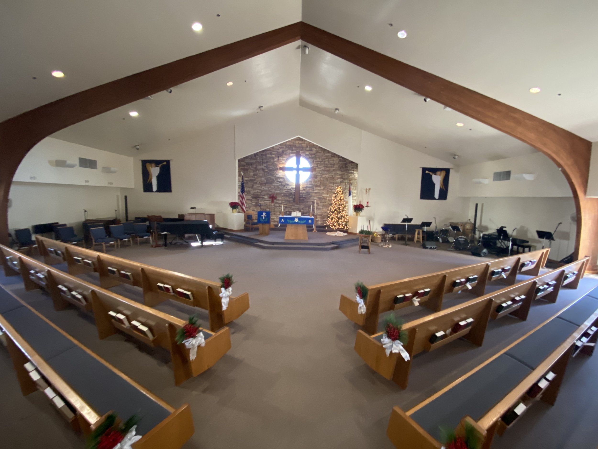
Our sanctuary today (taken in Advent). We’re imagining what we could do with this, how make it a place for future generations to encounter God. What could bring us into the future? The room is one thing that I consistently get feedback from visitors on, particularly the rock wall with the cross. it conveys a sense of transcendence and warmth that people are drawn to.
The plan is to start with the inspiration, the values, and work down to the specifics, let the specifics emerge from the brainstorming, instead of jockeying and negotiating between personal preferences. We want to position our sanctuary to be a space to encounter God, not just today, but 30 years from now. You can’t predict what that will be, but you can create a “context” for the next generation to experiment and experience in.
Doing God’s work today is not a game of just working harder, but when you can’t predict so much of the future, and things change so quickly, you have to be in a perpetual state of openness to the Spirit and adaptability, to let God speak and let the new direction emerge from prayer, community, and worship.
Peace,
Pastor Lars
Advent Mid-Week Worship - Dec. 7, 2022
Mid-week Advent healing service from Lord of Grace Lutheran Church. Meditate, reflect, refresh, and take time to be in the presence of God and bring your concerns and thoughts to God in prayer.
Original music by Stuart Oliver of oldbisbeerecords.com
Liturgy by Sara Are of sanctifiedart.org
Sermon by Rev. Jacqui Pagel of the Grand Canyon Synod
Our bishop and synod staff have been gracious enough to post sermons for use in our congregations in these stressful times. Here is Rev. Jacqui Pagel, Assistant to the Bishop for Candidacy.
Greetings from San Juan Bautista
In case you missed it in the service Sunday, we got special greetings from our partner congregation in Tucson - San Juan Bautista. They’re our only ELCA Spanish-speaking church in Tucson, and we’ve been doing combined things together for years - such as youth events and projects. Here’s Pastor Mateo Chavez bringing his greetings to us.
Lent Sermon Series - Questions for God 2.0
For Lent, the forty days before Easter, this year we will continue our series on “Questions for God”, exploring topics of faith, doubt, struggle, and loss. Why do we find God in darkness? Does God really help those who help themselves? Why aren’t we all promised victory?
Both services.
March 10, 17, 24, 31, April 7
Thanksgiving Altar
Give thanks to the Lord, for all that he has done for us.
And give thanks to Darlene Paul for this awesome Thanksgiving altar display.
All Saints Day Crosses
In keeping with tradition here at Lord of Grace, we put up the crosses we decorated in memory of loved ones up on the front stone wall.
